responsive design

Innovative Web Design: Exploring the Latest Trends in Professional Design

Innovative Web Design: Exploring the Latest Trends in Professional Design

The world of web design is constantly evolving. As new technologies and trends become available, it’s important for professional designers to stay ahead of the curve. Innovative web design can be a powerful tool for businesses, allowing them to stand out from the competition and make a lasting impression on visitors.

With the right web design, businesses can create an engaging experience that encourages users to stay on their website longer and interact with the content. We look at how businesses can make use of modern web design techniques to attract more visitors, boost engagement and make their online presence stand out. We also consider how good web design can help businesses increase their visibility on search engines and establish their credibility with potential customers.

Utilizing Responsive Design

This approach is based on the idea of creating a website that is automatically optimized for any device, from desktops to mobile phones. Responsive design allows for the website’s layout to dynamically adjust to the viewport size of the device it is being viewed on, ensuring an optimal user experience regardless of the device used. Additionally, responsive design is beneficial from an SEO perspective, as it reduces the need for creating separate websites for each platform. Responsive design is quickly becoming a standard for professional web designers and should be a key consideration for any modern website.

Incorporating User-Friendly Navigation

Incorporating user-friendly navigation into your web design will make it easier for visitors to find what they’re looking for and find their way around the site. This is especially important for e-commerce websites, where visitors need to be able to quickly find what they’re looking for and make a purchase. To make sure your navigation is user-friendly, focus on keeping it simple and creating a layout that is easy to understand. Utilize drop-down menus to organize content and provide additional levels of navigation, and use hover effects to make it easy to identify what page a user is on.

Webdesign Block – 23 Examples and Resources

Following the advent of the grids in webdesign, layout based on blocks of content or blocks of images may be a good strategy for some web designs. That’s why we will show a brief overview of such sites and resources that will inspire you’re in order to create your site based on blocks.

Planning to launch website based on Webdesign block?
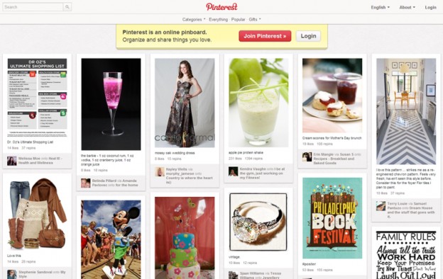
Layout based on modular blocks of content has become essential for portfolios, websites inspiration, in short they are often sites of a large batch of images. Made popular by sites like Pinterest for example, or inspired by applications like Flipboard or the Metro design on Windows Phone 8 devices, navigation is quick and easy, offering a lot of content which is scannable quickly.

The responsive web design also plays a crucial role: by definition a modular unit will adapt to the size of the user’s viewpoint. This type of layout is well suited to different mobile devices today.

Since this kind of web design is used extensively today, I offer a small selection of websites that are well made ​​with this layout, and then invite you to test different tools and plug-ins to create your own website in modular blocks!

6 Web Designer Online Tools for Your Web Design Projects

Every web designer should be familiar with free web designer online tools which can save money and sometimes valuable time when working on their web projects. In this blog we are bringing you a selection of six sites offering services rather interesting.

On/Off FlipSwitch

On/Off FlipSwitch is a great web designer online tool which can help you to quickly and easily generate switch button type in pure CSS3. With few mouse clicks you can customize the color, size, active state… In addition buttons are animated!

Responsify.it

Create an adaptive grid in seconds with this free web designer online tool. Choose the number of columns, the size of the margins and break points. Once finished it only remains for you to upload your template in HTML, CSS and PNG.

Screenqueri.es

Screenqueri allows you to test your site on more than 30 pre-defined resolutions. Ideal for rapid responsive design testing. A great thing about this tool is that it already have predefined screen sizes for large number of mobile devices such as iPhone, iPad, Samsung Galaxy Series devices, HTC, BlackBerry and many other devices. You can also rotate the screen in other different positions simulating your website look when you rotate mobile device. The project is still in Beta (December 12th, 2012) and so far I didn’t find any problems or bugs.